
The Caret on Popover in PrimeVue is a common user interface (UI) pattern used in modern web applications to provide additional, contextual information. It typically appears when a user interacts with a specific element, such as clicking a button or hovering over an icon. In PrimeVue, a popular UI library for Vue.js, the popover component is frequently used, but one notable aspect developers might want to customize is the caret—a small arrow that points from the popover to the triggering element.
In this article, we will explore the concept of the caret on a popover in PrimeVue, its functionality, how to implement it, and some advanced customization techniques.
What is a Caret in Popovers?
The caret is the triangular pointer seen in many popovers and tooltips. Its purpose is to visually link the popover to the element that triggered it, making the interface more intuitive and user-friendly. In PrimeVue, although a caret is not automatically included in the default implementation of a popover, it can be added through CSS.
Why Use a Caret?
Carets improve user experience by providing visual cues. Without a caret, users might have a harder time associating the popover with the element that triggered it. It adds clarity, especially when the popover appears close to multiple elements, as it clearly indicates which element the additional information relates to.
Implementing a Caret in PrimeVue Popover
To implement a caret in a PrimeVue popover, you’ll need to customize it using CSS. PrimeVue itself doesn’t offer a built-in caret with its popover component, so the developer must manually create and style one. Below is a step-by-step guide to achieving this.
Basic Popover Implementation
First, ensure you have a basic popover setup in PrimeVue. Here’s an example of how to trigger a popover on a button click:
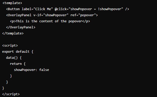
This basic popover doesn’t include a caret, but it sets the foundation for further customization.
Creating a Caret Using CSS
Next, to create the caret, you can use the ::before or ::after pseudo-elements in CSS. These elements are ideal for creating triangular shapes, which can serve as the caret.
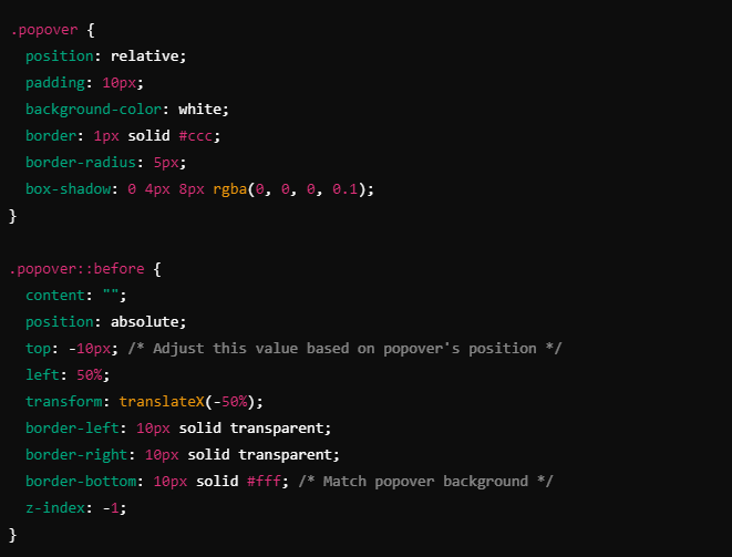
In this example, the ::before pseudo-element is used to create a downward-pointing caret at the top of the popover. The caret is styled using border properties to form the triangular shape.
Positioning the Caret
Depending on where the popover appears—above, below, to the left, or to the right of the trigger element—you’ll need to adjust the caret’s position. Here are some common scenarios:
- Top Position: When the popover appears above the element, place the caret at the bottom using
border-topinstead ofborder-bottom.
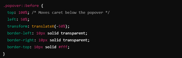
- Bottom Position: For a bottom-positioned popover, place the caret at the top using
border-bottom. - Left and Right Positions: If the popover is to the left or right of the trigger element, adjust the caret’s orientation using
border-leftorborder-right.
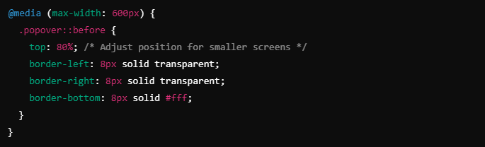
Ensuring Responsiveness
When working with responsive designs, it’s important to make sure that your caret remains correctly positioned regardless of the screen size. You can achieve this by using relative units like rem or em instead of fixed pixel values and by leveraging CSS media queries to adjust the size and position of the caret on smaller devices.
Advanced Customization
Beyond the basic implementation, PrimeVue’s popover can be further customized to enhance both design and functionality.
Animations
You can add animations to your popover and caret using CSS transitions. This creates a smoother user experience when the popover is shown or hidden.
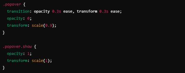
By default, PrimeVue provides an API for handling the visibility of the popover, so you can easily integrate this with your CSS to create dynamic effects.
Dynamic Caret Positioning
In some cases, the position of the popover may change dynamically based on available screen space. To handle this, you can calculate the appropriate position of the caret using JavaScript, ensuring that it always points to the trigger element no matter where the popover is displayed.
Common Issues and Solutions
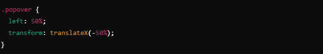
Caret Misalignment
One issue developers might face when implementing a caret is misalignment, where the caret doesn’t perfectly point to the triggering element. To solve this, ensure that both the popover and caret are centered relative to the trigger element.
Mobile Responsiveness
On mobile devices, small touch targets and overlapping UI elements can cause issues with popovers. To avoid this, make sure the popover is appropriately sized and that the caret is large enough to be visible but not overwhelming.
Conclusion About Caret on Popover in PrimeVue
Adding a caret to a popover in PrimeVue enhances the visual connection between the popover and its trigger element. Although PrimeVue does not include a caret by default, it is relatively easy to implement one using custom CSS. By following the steps outlined in this article, you can create a polished, user-friendly popover with a customizable caret. Additionally, handling responsiveness and potential issues like misalignment will ensure that your implementation works smoothly across different devices and screen sizes.
Also Read: spipdoc_file_11683.pdf: A Dive into SPIP Documentation