

PrimeVue is a popular user interface (UI) library designed for Vue.js. One of its powerful components is the OverlayPanel, a useful tool for displaying information that pops up over other content. Sometimes, however, the default size of the OverlayPanel might be too large for your specific needs. In this guide, you’ll learn easy ways to make size of overlaypanel smaller primevue, which can lead to better design and usability in your application.
Reasons for Resizing the OverlayPanel
There are several important reasons why you might want to resize the OverlayPanel in PrimeVue. A large panel can feel bulky and may not fit well within your app’s layout. If the content within the OverlayPanel is minimal, making it smaller can create a cleaner, more organized design. Smaller OverlayPanels also work better on mobile devices, where screen space is limited, providing a more user-friendly experience.
In addition, a smaller panel improves usability by allowing users to focus on the content, rather than being distracted by an oversized box. It also enhances the aesthetic of your application, ensuring the panel fits neatly into your existing design scheme. By resizing the OverlayPanel, you can align it more closely with your app’s style and enhance overall user interaction.
Customizing the OverlayPanel Size with CSS
One of the simplest ways to resize the OverlayPanel in PrimeVue is by modifying its size through CSS. PrimeVue uses the .p-overlaypanel-content class to control the content of the panel. By targeting this class with CSS, you can easily adjust both the width and height of the OverlayPanel to suit your needs.
Here’s an example of how to resize the OverlayPanel using CSS:
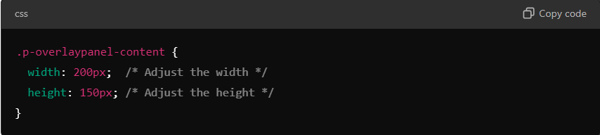
In this example, the width of the OverlayPanel is set to 200 pixels and the height to 150 pixels, but these values can be changed to fit your design. This approach provides a quick and flexible way to make the OverlayPanel smaller while maintaining control over its dimensions.
Inline Styling in Vue for Quick Adjustments
Another method for resizing the OverlayPanel is to use inline styling directly within your Vue component. This approach allows you to apply styles directly to the component without needing to edit external CSS files. It’s a convenient solution for making quick adjustments.
Here’s how to implement inline styling in your Vue component:
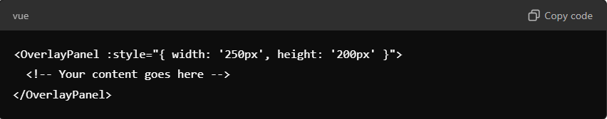
This code adds a width of 250 pixels and a height of 200 pixels to the OverlayPanel, which you can modify as needed. Inline styling is particularly useful for smaller projects or when you need to resize only one specific panel in your application.
Dynamic Resizing with JavaScript
In cases where the size of the OverlayPanel needs to adjust dynamically based on user actions or changing content, JavaScript can be used. This method allows for more flexibility, especially if your panel content varies depending on the situation.
You can achieve this by adding an event listener to the OverlayPanel and adjusting its size accordingly:
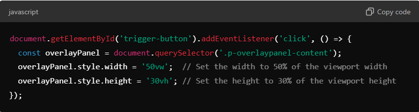
This approach dynamically adjusts the size of the OverlayPanel based on the viewport, making it especially useful for responsive applications or when the panel content varies frequently.
Responsive Design for Mobile Devices
When creating applications that need to work well on mobile devices, resizing the OverlayPanel becomes essential. Large panels can be cumbersome on smaller screens, making the app difficult to navigate. To ensure your OverlayPanel looks great on all devices, including smartphones and tablets, you can use media queries to adjust the size based on screen width.
Here’s an example of a media query that resizes the OverlayPanel for mobile devices:
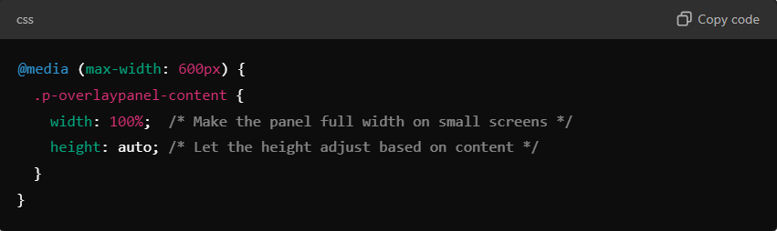
This ensures that on screens smaller than 600 pixels wide, the OverlayPanel takes up the full width of the screen, while the height adjusts automatically based on the content. Using media queries is an excellent way to maintain a responsive and user-friendly design across different devices.
Optimizing the OverlayPanel for Dynamic Content
In some cases, the content inside the OverlayPanel might change dynamically based on user actions or data updates. When this happens, the size of the panel needs to adjust automatically to accommodate the new content. You can handle this with a bit of JavaScript to ensure the panel remains functional and looks good, no matter what content is inside.
Here’s a basic approach to handling dynamic content resizing:
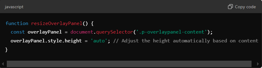
This method ensures that the height of the panel adjusts dynamically depending on how much content is inside. This is particularly useful when the content is loaded asynchronously or when it varies depending on user interactions.
Common Problems and Troubleshooting
When resizing the OverlayPanel, you might encounter some common issues. One problem is that content might overflow if the panel is made too small. To fix this, ensure that the content inside the panel is sized appropriately and consider increasing the panel’s dimensions slightly if necessary.
Another issue is that shrinking the OverlayPanel too much can disrupt the layout around it. If this happens, try adjusting the padding or margins to balance the design. It’s also important to test the panel on different devices and browsers to make sure the resizing behaves consistently.
PrimeVue Theme Integration for Global Resizing
If you are using a PrimeVue theme, you can resize the OverlayPanel globally by modifying the theme’s CSS. This allows you to set a default size for all OverlayPanels across your application, ensuring consistency and saving time.
Here’s an example of how to integrate the resizing into a PrimeVue theme:
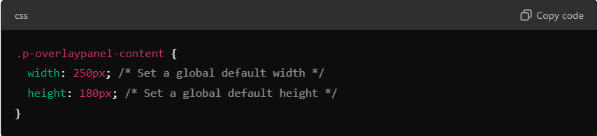
By setting these default sizes in your theme, you ensure that every OverlayPanel in your app has a consistent size, making it easier to manage multiple panels and maintain a uniform look.
Conclusion
Make size of overlaypanel smaller primevue is a simple yet effective way to improve the design and usability of your application. Whether you choose to adjust the size using CSS, inline styles, or JavaScript, reducing the panel’s dimensions can enhance the user experience and ensure your app looks great across all devices. Always remember to test your changes on different platforms, especially mobile, to ensure a seamless and responsive interface. By following the steps outlined in this guide, you can create a smaller, more user-friendly OverlayPanel that fits perfectly within your app’s design.