

As web development evolves, responsiveness has become essential in providing seamless user experiences across devices. However, certain UI components, like the Popover in PrimeVue, might sometimes face issues when it comes to adapting to different screen sizes. Whether you’re working on a desktop-friendly application or targeting mobile devices, ensuring that components remain functional and aesthetically pleasing is crucial. This article will walk through solutions and best practices to address responsiveness issues with the PrimeVue Popover component.
Understanding the PrimeVue Popover Component
PrimeVue is a popular UI library for Vue.js that offers a wide range of components designed for modern web applications. Among these is the Popover, a lightweight, contextual overlay typically used to display additional content or actions. While it’s great for showing compact information, some developers encounter issues when trying to make it responsive, especially when switching between desktop and mobile views.
Key Responsiveness Issues with the Popover Component
Before diving into solutions, it’s important to identify common issues developers face when using the PrimeVue Popover component in responsive designs:
- Overflowing Content: On smaller screens, the content within the popover might overflow beyond the viewport, causing usability issues.
- Incorrect Placement: The popover may not adjust its position based on screen size, sometimes appearing outside the visible area.
- Fixed Width or Height: Without proper scaling, the popover might retain fixed dimensions, making it difficult to read or interact with on mobile devices.
- Poor Touch Support: Popovers designed for desktop environments may not be optimized for touch interactions on mobile devices.
Now that we understand the challenges, let’s explore various solutions and best practices to make the PrimeVue Popover component fully responsive.
Ensuring Proper Media Queries
One of the most straightforward ways to make any component responsive is by using media queries. Media queries allow you to apply different styles depending on the screen size, making it easier to adjust the popover’s layout and position for mobile devices.
Here’s an example of how you can use media queries to improve the responsiveness of the Popover component:
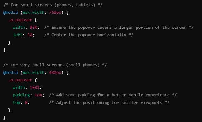
Why Media Queries Are Effective
By using media queries, you can provide customized styling for different device widths, ensuring that the popover is always visible and functional. This technique allows for flexibility, especially when working with varying screen sizes.
Leveraging PrimeFlex for Responsive Layouts
PrimeVue comes with PrimeFlex, a CSS utility library designed to enhance responsiveness. Using PrimeFlex classes, you can create layouts that adjust automatically across different screen sizes without having to write custom CSS.
Here’s an example of how to use PrimeFlex to ensure your popover content remains responsive:
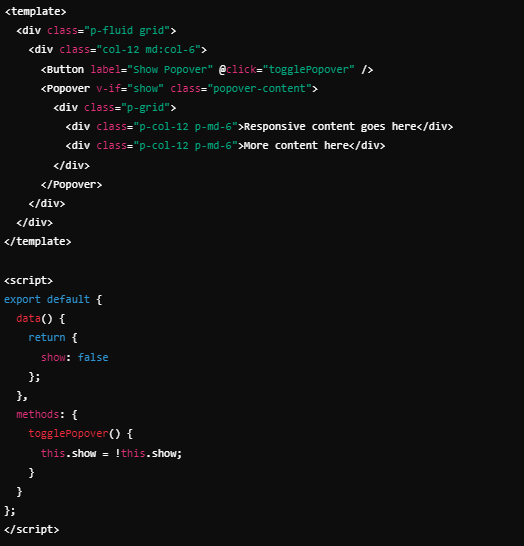
Advantages of PrimeFlex
Using PrimeFlex allows you to quickly create responsive layouts without writing custom styles. The grid system ensures that your popover content is organized and adapts to different screen sizes, maintaining a clean and functional user experience.
Adjusting Popover Positioning Dynamically
One common issue with popovers is improper positioning on smaller screens. For instance, the popover may appear off-screen or misaligned. To fix this, you can dynamically adjust the positioning based on the current screen size using Vue.js and lifecycle hooks.
Here’s an approach you can take:
- Track Screen Size: Use JavaScript to track the screen size and adjust the position of the popover accordingly.
- Set Popover Position Dynamically: Modify the top and left values of the popover based on the viewport dimensions.
Example code:
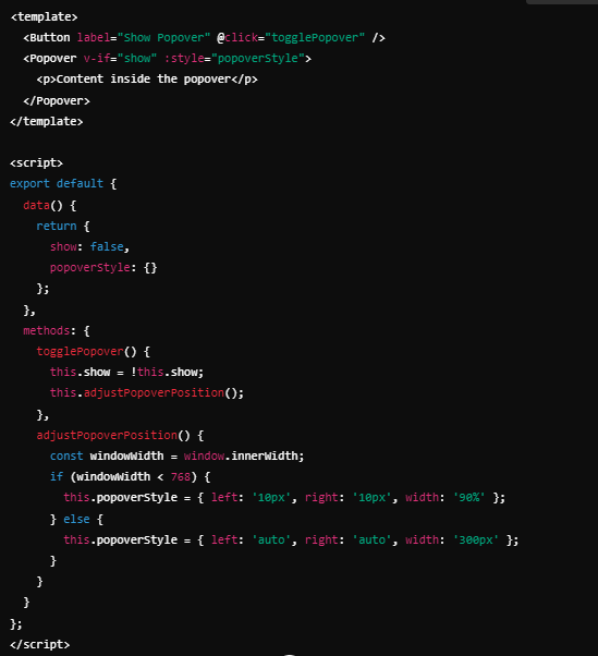
Why Dynamic Positioning Helps
This method ensures that the popover is always visible and well-positioned, regardless of the screen size. It also improves usability by preventing the popover from being clipped or hidden off-screen.
Optimizing Content for Mobile Devices
When displaying content in popovers on mobile devices, you need to ensure that the content remains readable and easy to interact with. One of the key principles in mobile-friendly design is to use scalable units (like em, %, or rem) for fonts and layout, instead of fixed pixel values.
Here are some tips for optimizing popover content for mobile:
- Use Flexible Layouts: Use flexbox or grid to organize content within the popover. These layouts naturally adjust to available screen space, making them ideal for responsive design.
- Avoid Overloading with Content: On smaller screens, try to limit the amount of content displayed in the popover to essential information. For more extensive content, consider using a modal or a new page.
- Adjust Tap Targets: On mobile devices, touch interactions are key. Ensure that any buttons or links within the popover are large enough to be tapped easily.
Use the Latest PrimeVue Version
Another potential issue could be outdated libraries. PrimeVue is frequently updated to include new features and bug fixes. If you’re experiencing responsiveness issues, make sure you’re using the latest version. Check the PrimeVue changelog for any updates related to the Popover component, as new releases might address specific bugs.
Steps to Update:
To update your PrimeVue library, run:

Keeping your libraries up to date ensures you have access to the latest features and fixes, reducing the chances of encountering responsiveness issues.
Conclusion About Making the PrimeVue Popover Component Responsive
Ensuring the Popover component in PrimeVue is responsive is crucial for providing a seamless user experience across devices. By leveraging media queries, PrimeFlex, dynamic positioning, and proper content optimization, you can address common issues like overflowing content, improper placement, and fixed dimensions. Additionally, staying up to date with the latest PrimeVue releases will help you avoid bugs and take advantage of the latest features.
Also Read: Unraveling the Mystery of 4386220871: What Could It Mean?
With these techniques, you can build a responsive and user-friendly popover that works well across all screen sizes, providing your users with an intuitive and accessible interface.